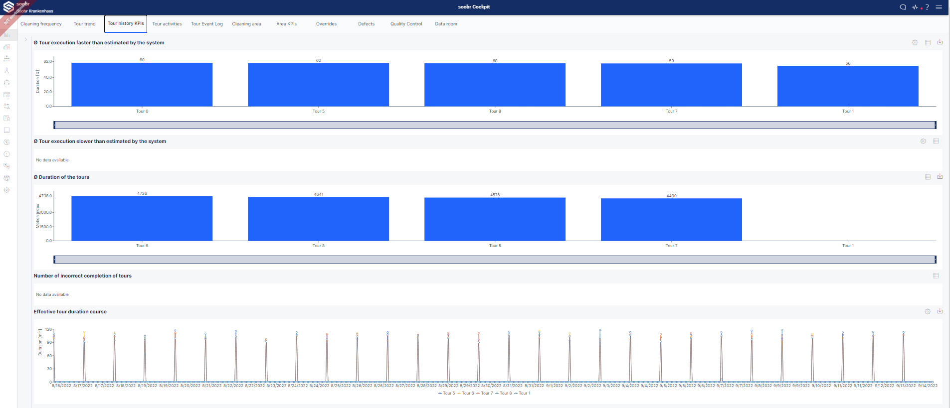
The analytics tool »Tours History KPIs« provides an overview of the most important soobr key performance indicators (KPIs).
Tour History KPIs
By default, the viewing period can also be filtered here on the left side of the view. Depending on the resolution of your monitor, the diagrams cannot be displayed completely, but you can use the slide gray slide bar below the diagram.

By default, the diagrams are displayed with relative values – i.e. not in a specific unit but in percentages. this can be changed in the view that appears by hitting the settings button - directly next to the download button.
|
KPI |
Description |
|
Ø Tour execution faster than estimated by the system |
The soobr algorithm calculates an execution time for each individual tour. If the effective execution of the tour is faster, this is shown graphically here in this column chart. Precisely, the daily average is displayed here and shows how many percent or minutes the effective cleaning time was faster than the calculation. |
|
Ø Tour execution slower than estimated by the system |
This column chart represents exactly the opposite of the upper chart. Namely, it is showing how much the cleaning time was slower than the calculated time. Accordingly, a tour can only appear in one of the two diagrams. These are also average values over the selected period of time. |
|
Ø Duration of the tours |
This corresponds to the averaged movement value from the end device. |
|
Number of incorrect completion of tours |
This chart lists the incorrectly completed tours for the respective period of time. Incorrect completion is understood if the cleaning tour is not completed on the end device. |
|
Effective tour duration course |
The tour duration is shown graphically in this line diagram. All tours are recognizable in their own color. Therefore changes over time are easily noticeable. When the mouse is hovered over this chart, the exact numbers appear in a separate window. |
Comments
0 comments
Please sign in to leave a comment.